

Update your Welcome Page image to get more subscribers.
The Substack Welcome Page is seen by all your website visitors, but it is the most neglected of all your Substack pages. Let's fix this today!

Hi Me Time Friends,
I don’t know about you, but I have this incredibly strong need for the things I create to look nice, even beautiful, professional… or at least tidy.
And I get frustrated with technology that is not customisable enough for my design needs (to be read control freak + perfectionist needs).
One of the most boring, messy pages we all need to live with on Substack is the Welcome Page! This one.
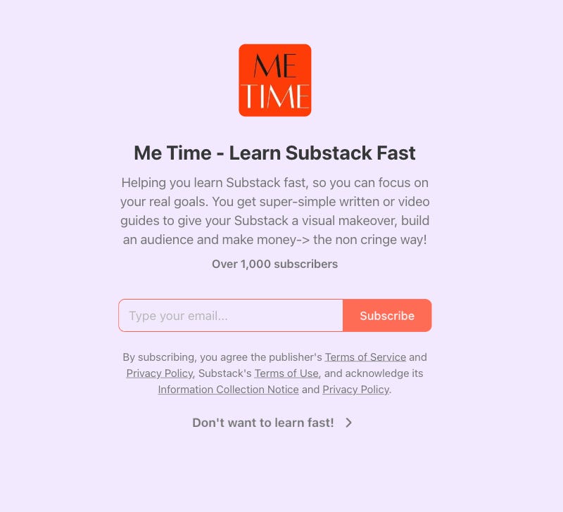
But we do not have to live with this messy, insipid page anymore!
I have found a way to make it look much much better!
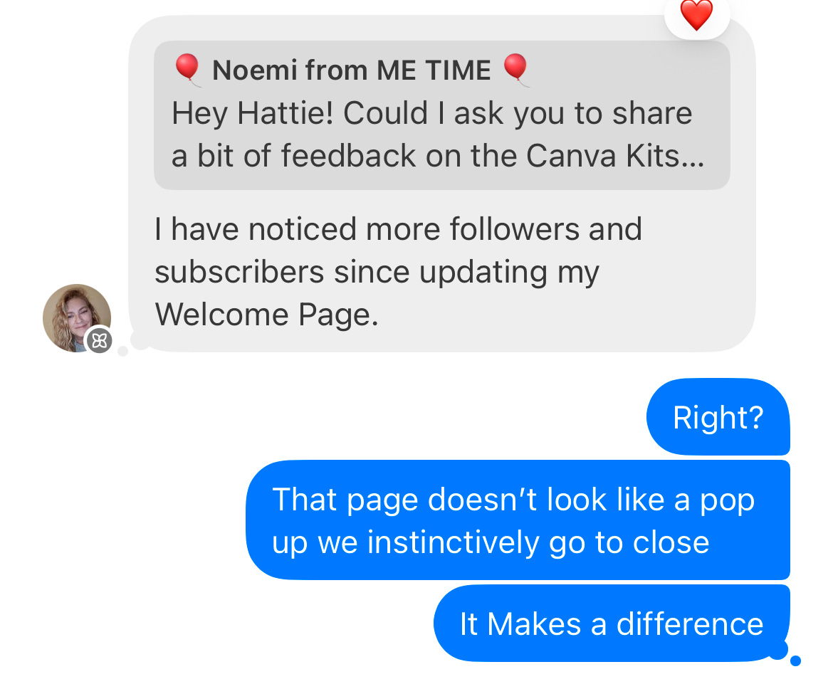
BONUS! Since I have updated my welcome page, my subscriber number went way up…. Not sure if this is a direct cause of the welcome page update… you update yours and let me know what happens for you but feed back coming in says it makes a difference 🎉🍾🥂!
P.S. This article got too long for email so read the entire guide here.
Welcome page basics
The default welcome page settings can be found in
Dashboard → Website Editor
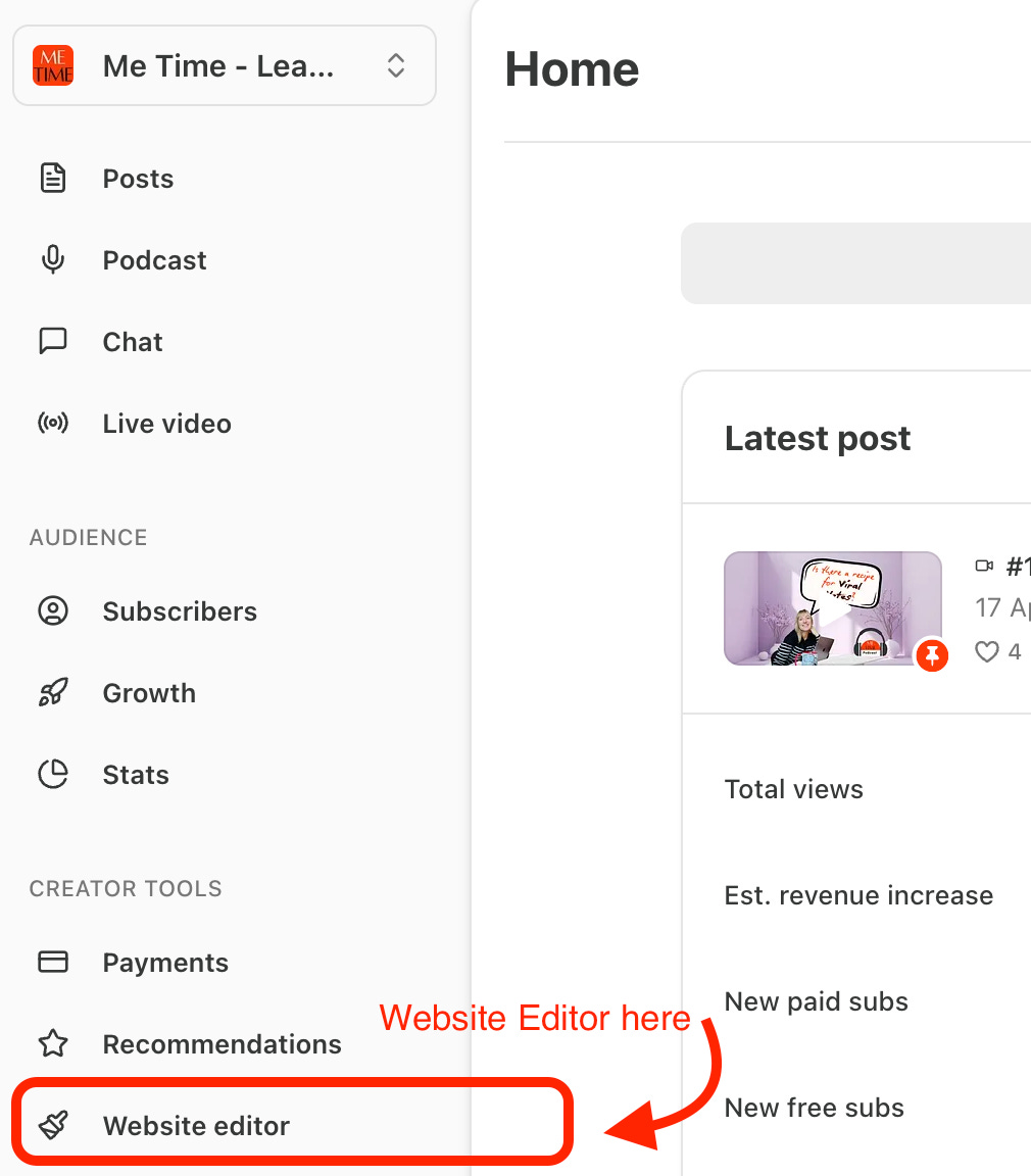
Then go to → Welcome Page
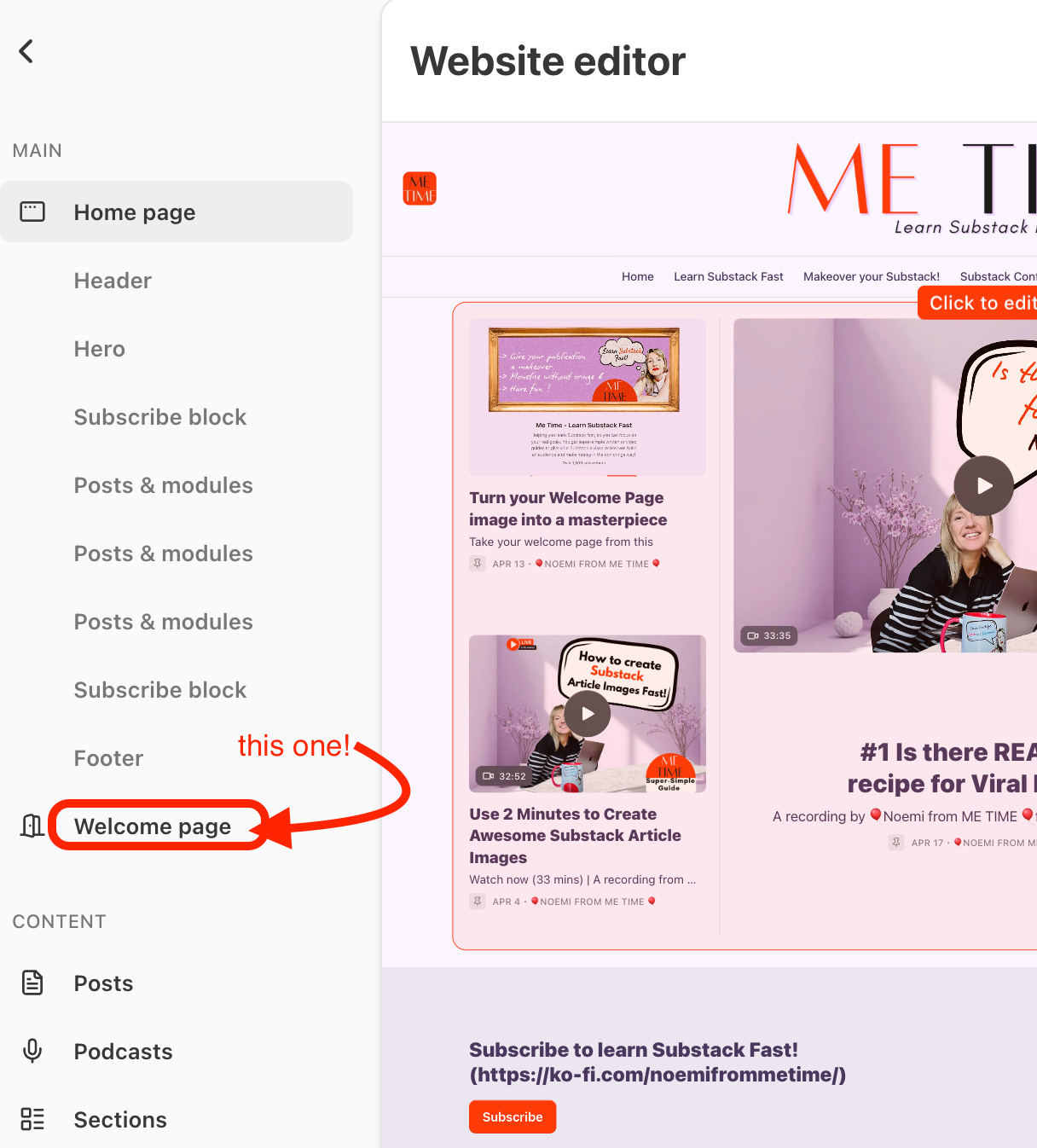
You will find some editing options there on the right hand side of the desktop.
Very basic, I must say.
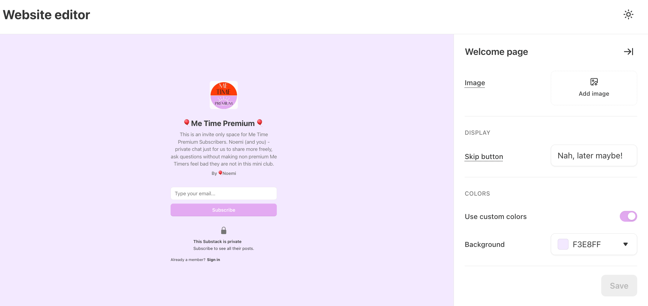
Options:
a. You can add an image (that will reveal more welcome options once you add an image… not sure why… hidden feature 1 unlocked)
b. Customise the skip button
I.e. Try to find something that could make it feel like they are missing out if they say No to subscribing… I use “Don’t want to learn fast.” Obviously, the message needs to work for your publication…. Mine is Me Time: Learn Substack Fast so it make sense ;).
c. Use custom colours or not….
BOR-RING!!!!!!!!!!!!!!!!!!!!!!!!!!!!!!!
However….. As I said, the moment you upload a photo…. some more options show up. Not sure if this is a BUG or on purpose…
d. “Show Name” (publication name)
e. “Show Description” (publication description i.e. the one you create in Dashboard→ Settings→ Basics→ Publication short description.
See the below screen grab!
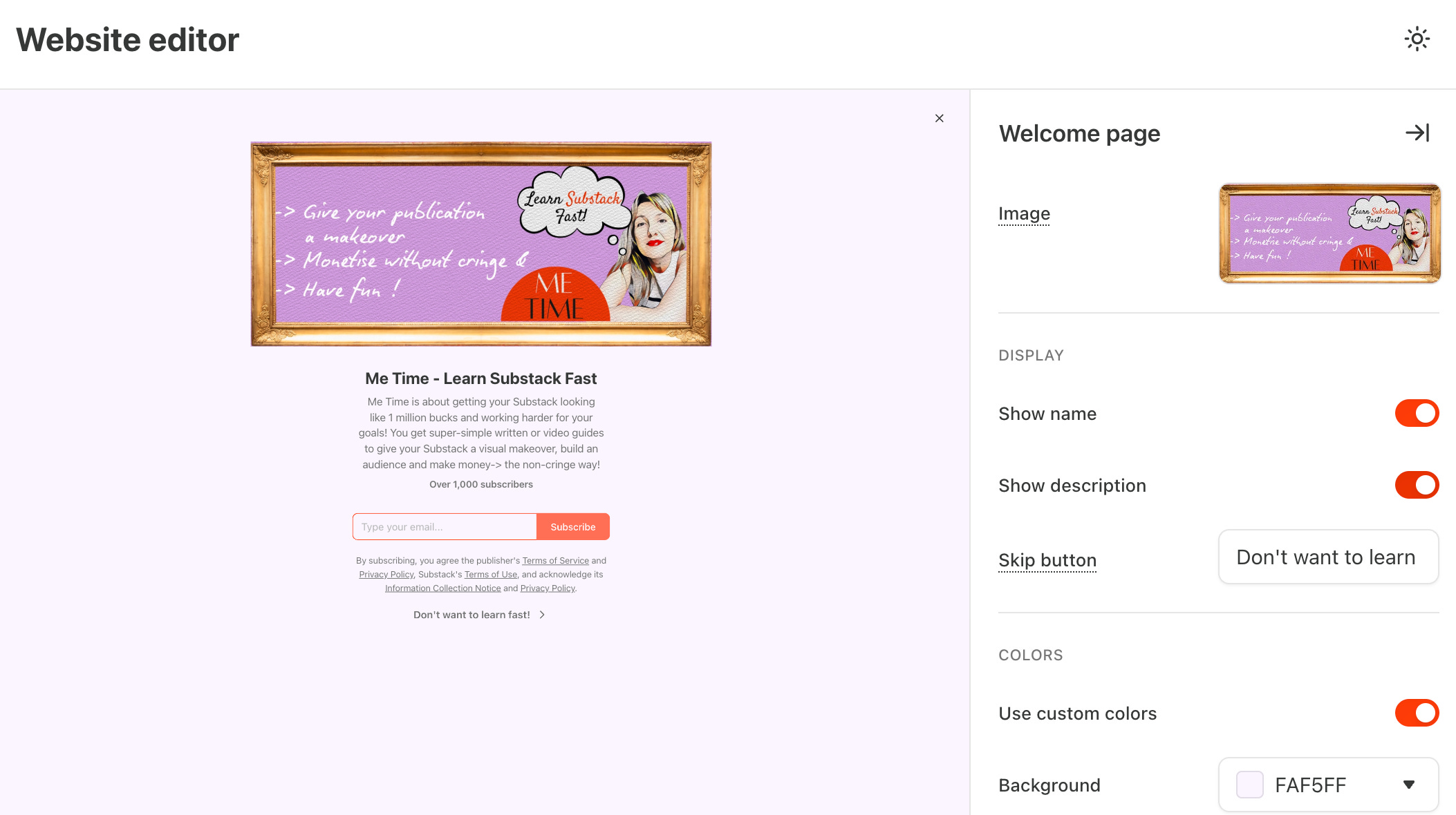
As my welcome image has now the reasons to subscribe, the short description was looking too messy → so I scrapped it.
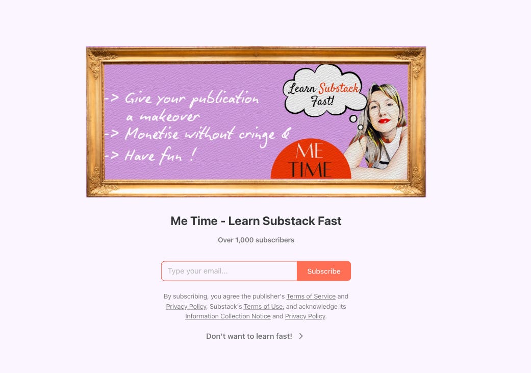
This is my welcome page now… More streamlined and getting me more subscribers since I changed it 5 days ago.
Now is the time to thank Jess, The Creator whose article1 reminded me that the Welcome Page even existed…. And her article has some awesome extra tips so definitely give it a read. I will share it in the see the article in the footnotes and in the Me Time Chat.
Now for the Image. I will show you how to create one plus some do’s and don’ts I recommend, but you do you!
2 Examples:
Here is my subscriber The Oracle Cafe - Hattie who already created her Welcome Page and shared it with the class!
How cool is this?
A+ to Hattie! Click on the pic to see her publication and awesome welcome page LIVE.

Another awesome Subscriber Dr. Nicole Pertillar 🔴 from the Pause for Solos created this one- I love cartoon Nicole sharing why to pause with her.

Welcome Page Tips
Now the fun part! Creating an awesome image.
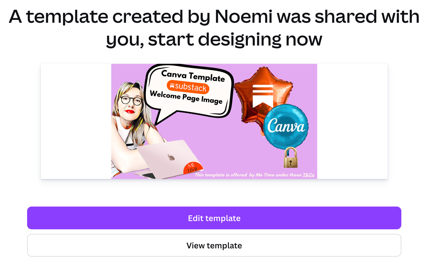
As always, I will share an awesome Substack Template to create your own customizable one for Me Time Premium Subscribers.
Main Tips:
Square Images show up very narrow … if you like that look, go for it.
Here are how some other image sizes show up on your welcome page. Pick the one that you like best. I recommend
Upgrade to Me Time Premium to get the rest of this article, PLUS my customizable Substack Welcome Page template plus the Basic Canva for Substack Makeover kit to give your ENTIRE Substack a makeover in as little as a day. I do it in way less… but I am a pro by now…
Behind the paywall
plus the Substack Redesign Kit

To upgrade to Me Time Premium, press the below button.

If you despise subscribing to things, there’s also my GumRoad product as a one-time purchase:
